After all the posts about the world’s cultural wealth, let’s get tasteless.
Many historic temples grace the northern Thai town of Nan, so I spent several days there. Wat Ming Muang was low on my list because Michael Freeman, in “A Guide to Northern Thailand and the Ancient Kingdom of Lanna” wrote that it’s “in stunningly bad taste”. But I enjoyed it, and my tastes aren’t that bad. No pink flamingos in front of my house. But taste and judgements about what’s beautiful are greatly influenced by culture. Thai thought patterns are unique, and often difficult for outsiders to understand. A closer look at Wat Ming Muang will give us a perspective on a fascinating world.
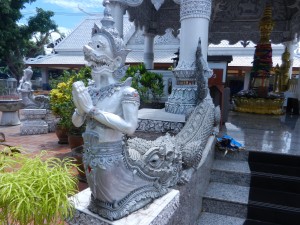
OK, I agree that the above guardian’s ugly. But it’s supposed to be–it keeps souls with bad intentions out.
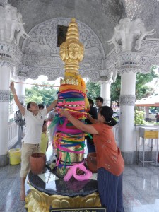
Many good spirits successfully entered to pay respects to the temple’s city pillar in the form of Shiva linga–a phallic symbol adapted from India about 2,000 years ago, which embodies the land’s power to generate life. So the temple does lots of business–many locals see it as a source of well-being.
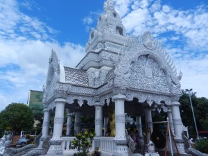
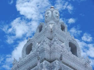
From a distance the pavilion that houses the linga looks as tasteless as a faux diamond suit. But look closely and a beautiful world opens up.
I began to enjoy the colors:
1. The white that dominates the temple seemed tasteless at first. But it’s no more so than the golds and silvers in most Thai shrines. All these hues are cheerful. And they glow–they evoke a luminous spiritual world. Under the tropical sun, they seem to radiate energy, and their cheeriness makes it benevolent.
2. The baby-blue background softens the white.
The roof’s crown’s tapering form and the building’s color scheme make it seem to dissolve into the sky. At the top, the Buddha smiles into the 4 cosmic directions. His compassion reigns in the center of it all–earth and sky, energy that generates life and the profusion of forms and colors that come from it. Now look inside–
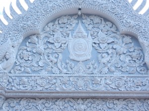
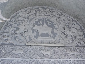
Each of the 4 sides’ upper area is covered with designs in the same colors. They blend a lot of cultures’ ideas. At the bottom, you can see Chinese Zodiacal animals. The bull in the center is Shiva’s traditional mount–an idea which Thais inherited from India. A graceful Thai stupa rides on its back. And lush vegetal patterns embrace this multicultural blend.
Yeah, Wat Ming Muang’s profuse designs seem to reflect unrestrained imaginations. But everything blends in a way that transcends categories:
1. Multiple cultures.
2. The abundant vegetation in the tropics.
3. Colors that are both luminous and soft.
4. A building’s form that seems to radiate energy on Earth and dissolve into the tumbling clouds.
Things aren’t sharply distinguished or defined. All tolerantly mesh in an endless variety of ways. One beautiful perspective after another can open up. The Buddha’s compassion is the unifying theme, and all life forms can thrive with it.
But we haven’t looked at the main part of Wat Ming Muang yet–this is only the front pavilion. Michael Freeman said that the main assembly hall is what’s tasteless. We’ll explore it in the next post on Thai art. Is Freemen right, or will it take us into another luminous world?

Comments on this entry are closed.