I recently said that a lot of things in Islamic thought have deeper meanings than what you see on the surface.
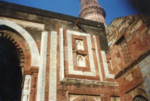
I took the above shot way back in 1996–yes, there were airplanes back then. If you look closely, you can see calligraphy carved all over the wall of this 14th century gatehouse to Qutb Minar, in Delhi, India. That was the first time I saw great Islamic art. It mesmerized me.
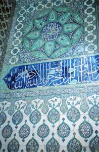
Ditto at the Topkapi (the Sultan’s crash pad in Istanbul) more than 10 years later. Many other Westerners have told me that they also find Islamic designs captivating. There are many reasons why Islamic calligraphy is one of the world’s greatest art forms, and appreciating it is essential for understanding the Islamic world.
1. The Koran was originally preserved orally, but its followers were concerned about its reciters dying. Arabs, as hardy traders in the Levant, had been in contact with Syriac script, and their ancestors, the Nabateans (who built Petra), had a rudimentary script. The alphabet that the Arabs synthesized in the 7th century was very angular. They felt that the script that God’s teachings are in should be beautiful, and they began to refine it. Westerners could say that beautifying the alphabet was a conscious decision, but many Muslims think that it was divinely inspired.
2. Arabic script was canonized by the 9th century, when Baghdad was the center of the Islamic world. Balance is a key concept–everything has to be proportionate with the first letter, alif. Alif is a straight vertical line, and its size is related to the dot–which is actually a small square which donkey-hair pens imprinted when pressed straight down. Alif’s height varies from 3 to 12 dots, depending on the script. Alif is 5 dots high in a style called naskhi. This is a very stately style, known for its clarity, and many Koran’s are written in it. Other styles, like the one in the bowl above, are more flowery–they have a taller alif. These rules of proportion give Islamic Calligraphy balanced aesthetics–the other Westerners and I found the patterns in mosques very soothing.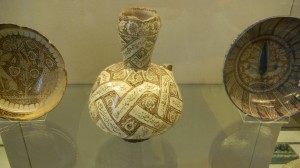
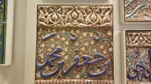
3. Calligraphers write from right to left, along a horizontal line. The rectilinear and curvilinear elements of letters go above or below the line–more exquisite balance. These handsome lines easily mesh with architectural forms–like in top picture. They take on a life of their own beyond the page, and they can beautify walls and ceramics, and spread God’s message through many media.
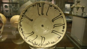
4. Arabic letters don’t stand alone, like Greek and Roman letters. They’re conjoined, and a letter’s form changes according to its position in the word–first, middle, or final letter. This gives scripts flexibility to wrap around the insides of bowls, and to be configured into more complex shapes. A recent post explained depths of Islamic concepts of the circle, and of the Five Pillars of Faith. These ideas, and the nature of Islamic calligraphy, mesh into a very rich web of ideas and art forms.
The flexibility of Arabic script allows it to be a multi-media art form, and to mesh with some of Islam’s most basic concepts. Its balanced proportions make all these ideas and arts soothing–as though they’re coming from God. A letter is more than just an abstract shape and a system for storing information–it flows from the source of creation into several media, and fuses with many ideas. It pervades the world God created and helps to keep it in order.
Since Islamic calligraphy is so pervasive and easily mixed with many ideas, you can bet that it has deeper meanings too. We’ll explore some of the deeper ideas behind this inexhaustibly rich art form soon.

Comments on this entry are closed.