Gothic style lives!
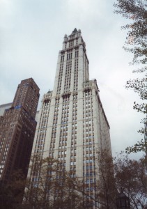
The Woolworth Tower was completed in Lower Manhattan in 1913. As the tallest building in the world with floors from bottom to top until the Chrysler Building eclipsed it in 1930, it reigned in full Gothic glory.
It still does–New Yorkers still consider it one of their favorite skyscrapers. The Shanghai World Financial Center was designed after yin-yang flows of energy. The Woolworth Tower used the West’s hallowed lines and arches. Cultures often use their most traditional art forms when they build their tallest buildings. A few more examples show that you can often see the ancient world in the modern.
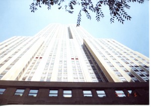
The Chrysler Building and the Empire State Building (finished in 1931–often called the Empty State Building because it took many years to fill it with tenants during the Great Depression) eclipsed the Woolworth Tower with forms that are more modern. Both eclipsed the Eiffel Tower and did it without reaching back to an older European style (give or take a few art decco gargoyles on the Chrysler Building). But–
These modern business temples used linear forms as exquisitely as the ancient Greeks did. Skyscrapers were designed as a series of blocks that progressively recede from the street. From the sidewalk they seem to rise without end. From a distance, their massive lower sections and soaring upper sections balance each other.
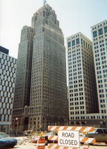
This became the standard skyscraper form. Buildings like the Penobscot in Detroit (above, completed in 1928), the Terminal Tower in Cleveland, and the Russ Building in San Francisco followed these artful uses of abstract lines and geometric shapes, and established them as the standard in Middle America and the West.
Lines and Euclidean shapes were thus the most basic visual elements in modern skyscrapers, as they were in ancient Greek temples, and Romanesque and Gothic cathedrals. Did this change when architecture became even more modern?
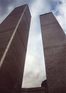
The World Trade Center’s two towers exemplified the giant box style that dominated skyscraper design from the late ’50’s to the mid ’70’s. Many people criticized this style for looking like an upturned shoebox. But the Trade Center’s towers were placed so they complemented each other. These two abstract forms dominated lower Manhattan. At that time, many saw them as a tasteless show of modern business muscle. But corporate America was only reaching back to the West’s ancient use of line and abstract shape to express ultimate truths.
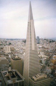
San Francisco’s Transamerica Building (completed in 1972) was one of the first big skyscrapers that went beyond the box form. Not everyone liked it at first–maybe it freaked out denizens of Grateful Dead concerts. But it also was modeled after a very ancient design, which was perfected in the Great Pyramid at Giza.
One of the reasons for this stress on line and plane is technical–architects in those days didn’t have the lighter and stronger synthetic materials that go into today’s great Asian skyscrapers. People had to work with the simplest forms to build high. But they did it with the same styles and standards of good taste that ancients and medievals used. The most pleasing use of these forms has always been one of the main expressions of truth and well-being–ideas that people running modern businesses want to convey.
Will corporate America start following these standards more often?

Comments on this entry are closed.